Claremont are a leading provider of commercial interior design, fit-out, furniture and technology. Using their expertise alongside inspirational design, they help organisations to move beyond the limits of their space.
Expansion plans and a dated identity left the original brand in need of a refresh to bring it up to date and to meet the changing aspirations of the business.
Our brief was to create a bolder, stronger brand that reasserted their capabilities and brought them to the forefront of a competitive market. It was important that this brand reflected their values and what they stood for, with a focus on experience, knowledge and delivering value for customers.
Going back to basics, we reviewed the existing company values and created a new positioning statement, company promise and statement about how the business wants to be recognised.
At the core we found that one main concept summed up the key brand proposition: flexibility. From this we created the brand strapline ‘We shape spaces’ – a strong and meaningful message which refers to shaping the physical environment as well as the shape of an organisation and the people within it.
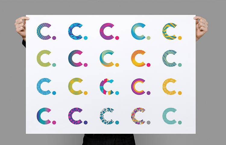
Once the foundations were established, we focused our attention on the brand identity and website. The new C logo has different design finishes using an array of patterns, to reflect the many different people that make up the business and the individuality of each and every client project too.

The new brand is not about absolutes – the old corporate guidelines with its list of ‘brand don’ts’ has been replaced with an empowering set of principles which keep the brand on track but without limits. The new brand maintains enough consistency to be identifiable but with enough variation to keep things fresh.
Breaking away from one corporate colour in favour of a vibrant primary and secondary colour palette, the new Claremont brand also uses imagery of employees to show the real face of its team.
"Since the re-launch just two months ago, pride in the new brand is palpable and morale is high."
"Wilson Cooke’s response was insightful and challenging and perfectly captured the essence of the business. The concept of individuality and creativity has been delivered with a wow."
Old and new clients, as well as a number of suppliers, have been in touch with Claremont to comment on the new brand’s freshness, vibrancy and distinctiveness.
Say hello:
T: 0161 764 6500
E: hello@wilson-cooke.co.uk
Twitter
LinkedIn